在 css 中,@keyframes 定义动画的关键帧,css 样式将会根据定义好的关键帧播放动画。
1
2
3
4
5
6
7
8
9
10
11
12
13
14
| .a {
width: 200px; height: 200px; background-color: red;
animation-name: resize;
animation-duration: 5s;
animation-iteration-count: 2;
}
@keyframes resize {
0% { width: 10px;height: 10px; }
100% { width: 200px; height: 200px;}
}
|
在 css 中可以使用 rgba 或者 opacity 来设置透明度.
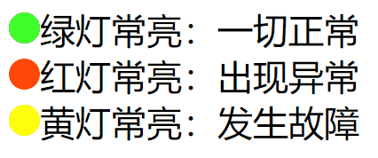
呼吸灯
1
2
3
4
5
6
7
8
9
10
11
12
13
14
15
16
17
18
19
20
21
22
23
24
25
26
27
28
29
30
31
32
33
34
| <style>
span {
width: 10px;
height: 10px;
display: inline-block;
border-radius: 50%;
background-color: green;
}
.r {
background-color: red;
animation-name: lig;
animation-duration: 1s;
animation-iteration-count: infinite;
}
.y {
background-color: orange;
animation-name: lig;
animation-duration: 1s;
animation-iteration-count: infinite;
}
@keyframes lig {
0% { opacity: 0.1; }
100% { opacity: 1; }
}
</style>
<span></span> 绿灯常亮:一切正常
<hr>
<span class="r"></span> 红灯闪烁:出现异常
<hr>
<span class="y"></span> 黄灯闪烁:出现警告
|
进度条
1
2
3
4
5
6
7
8
9
10
11
12
13
14
15
16
17
18
19
20
21
22
23
24
25
| <style>
.box {
width: 600px; height: 30px;
border: 1px solid red;
}
.bar {
width: 0px; height: 30px; background-color: green;
animation-name: pb;
animation-duration: 3s;
animation-iteration-count: 1;
animation-fill-mode: forwards;
}
@keyframes pb {
0% { width: 0%; }
100% { width: 100%; }
}
</style>
<div class="box">
<div class="bar"></div>
</div>
|

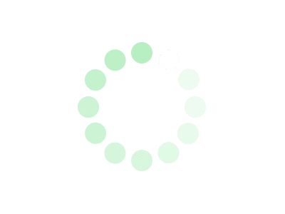
Loading
1
2
3
4
5
6
7
8
9
10
11
12
13
14
15
16
17
| <style>
img {
animation-name: trans;
animation-duration: 0.4s;
animation-iteration-count: infinite;
}
@keyframes trans {
0% {
transform: rotate(0deg);
}
100% {
transform: rotate(360deg);
}
}
</style>
<img src="https://oss.gaojie.cc/tedurefrush.png"/>
|